Thứ Tư, 15 tháng 5, 2019

Màu vẽ chân dung theo Roberts Howard (bản tiếng Anh, ko có tiếng Việt)

Setting a Palette with the Portrait Colors

Author: Roberts Howard, Contributing Editor


Color mixing is one of the most difficult aspects of painting. Back in Holbein's day it wasn't too difficult simply because there were so few colors from which to chose. Today's huge spectrum of colors makes choosing colors difficult. Should I choose a red that stays warm when mixed with white or should I choose one that becomes cool when mixed with white? The answer to the above question involves knowing the characteristics of more than two dozen red pigments - and five different whites.

Confusing? You bet. That's why skilled painters have always "set" a palette before painting. If you are about to paint a traditional portrait there's not much likelihood that you?ll need to have a bright lime green or electric blue on the palette . . . at least, not for the flesh tones. Similarly, one would set a different palette for painting a green meadow than for painting an arid arroyo.


Caucasian flesh tones are composed of yellows and reds with greys added to neutralize certain areas. Caucasian flesh tones have the widest variation within the individual face. There is wide variation in brown flesh tones, ranging from cool to warm but less variation within the individual face. What we think of as Asian flesh tones tend toward less variation than brown flesh tones and considerably less variation in tone within the individual face. The flesh tones of males of all races are usually depicted as somewhat darker and more richly colored than the flesh tones of corresponding females. Children are always depicted as having lighter flesh tones, on the order of the females of the race but with higher color in the cheeks, nose and ears.

The head can be divided into three areas: forehead, cheeks and jaw. The forehead receives light in such a way that it is generally ½ a Value higher in tone than the rest of the face. The blood supply is less than in the fleshy parts of the face and, as a result, the skin is more yellow in tone. The ochre and sienna mixtures can be used for the mass tone.


The ears, cheeks and nose (as well as the mouth) have an ample blood supply that makes them red. As people age that blood supply is less in evidence. Children and infants are characterized by their red cheeks. The reddish mixtures in the center of the palette are for those areas in the center of the face. They are mixed with the mass tone.


The area under the nose - the jaw, has the most neutral color. In men, that neutralized color is made prominent by the beard area. But even in women, that area has a bit less color than the other areas of the face. When painting women be very careful to avoid neutralizing that area too much or the sitter will appear to need a shave. The neutral tones of raw umber and ivory black are mixed with the mass tone.


The neck should be slightly neutralized. Visual greys made from alizarin crimson and viridian can be mixed with the masstone to produce a convincing area under the chin. Alizarin and grey can be mixed with the mass tone to render a convincing transition between the forehead and the hair.


The accompanying illustrations were done to show those tonal transitions, thus all of the transitions are more obvious than they should be. The above illustration would be a good basis for a more carefully painted oil portrait with the transitions made much more subtle in the final layers of paint.


The following illustrations are sketched out in gouache rather than oils but the same principles apply. The female head is painted somewhat lighter than the above head of a male. Notice that the jaw area, although neutralized, is not so greyed-down that it appears that she has a beard. The ears are redder than the cheeks, as is the nose. Note too that the upper lip is usually darker than the lower lip because it casts a shadow while the lower lip catches the light.


By mixing a burnt umber and burnt sienna in zinc white we can create a good mass tone for painting brown skin. The darker the skin, the higher the contrast with the highlights. A small amount of cerulean blue added to the highlights will make them more convincing.


Replacing burnt sienna in the previous mass tone with yellow ochre will give you a good mass tone for many Asian skin tones. A little viridian may be added to the yellow ochre. Notice how bothe the brown and Asian flesh tones show less differentiation between the forehead, cheek and jaw areas than we saw in the Caucasian flesh tone schema.


The whites of the eyes are never white. Also, you usually have four white areas to contend with, each of them is different. Look closely at this example and you?ll see that no two white areas are the same shade of grey. Mix a different tone for each of them.

Some passages and illustrations taken from Gouache For Illustration by Rob Howard - Watson Guptill, NY.

Rob Howard can be reached online at http://studioproducts.com/forum/forum.html


Thứ Tư, 8 tháng 5, 2019

Quá trình vẽ chân dung ướt trên ướt của FRUMAN FINCK


FRUMAN FINCK’S ALLA PRIMA PORTRAIT PROCESS

Image result for "FURMAN FINCK"

Charcoal drawing, spray with fixative
Vẽ bằng than chì, xịt fixative

APPLY A GRAY TONE
Vẽ tông Xám

Apply a tone of neutral grey (black, ochre and terre vert; thin to show drawing, wet to permit wiping)
Vẽ bằng tông xám trung tính ( đen, ochre và terre vert; tô mỏng để thấy hình vẽ, ướt để lau được)

With a clean cloth wipe away tone to establish lighted area removing gray not needed; establishing a study in monotone
Dùng vải sạch lau bớt để tạo vùng sáng, bôi phần xám không cần thiết; tạo tranh đơn sắc

LAY IN COLOR (SCUMBLE FLESH COLOR INTO WET GRAY TONE)
Đưa Màu vào (phủ màu da lên hình tông Xám còn ướt )

Apply a flesh tint (white, alizarin crimson and yellow ochre) especially in wiped areas trying to retain effects of the wiping); simply lay in the color in a blurred form (do not strive for finish or likeness yet)
Đưa màu da (pha bằng white, alizarin crimson and yellow ochre) nhất là những chỗ đã lau để giữ hiệu ứng lau); đưa màu vào nhòe nhòe thôi (đừng cố vẽ hoàn thiện hoặc vẽ cho giống)

ESTABLISH FEATURES
Phác đường nét

Draw in the features in a soft red or red orange (but do not develop)
Vẽ mắt mũi miệng bằng màu đỏ cam, hoặc đỏ dịu (nhưng không vẽ kỹ)

Using white, alizarin and viridian hatch in the gray, darkened areas
Pha white, alizarin và viridian vẽ các vùng tối, màu xám.

Develop the lighted areas in brighter focus, showing in particular where they turn from the light
Lên các vùng ánh sáng chiếu đến bằng điểm nhấn sáng hơn, nhất là nơi hứng sáng

SCUMBLE IN BACKGROUND
Phủ background

BUILD UP COLOR (ESTABLISH PLANES OF LIGHT AND DARK DESCRIBING FORM INTO FLESH COLOR)
Lên Màu (Lên các mảng sáng tối, diễn tả hình dáng bằng màu da)

Develop planes of face in light and dark colors
Làm nổi các mảng của khuôn mặt bằng các màu sáng tối

Emphasize light areas and suggest dark
Nhấn vùng sáng và gợi vùng tối

Identify one color tone against another working for a simple total effect
Xác định một tông màu dựa trên màu đang dùng để có hiệu ứng đơn giản chung

Color accents (pupil, lips, ear, nostrils)
Nhấn màu (tròng đen, môi, tai, lỗ mũi )

Suggest features and allow charcoal and color notes to frame them
Gợi đường nét và để than và màu viền khung các đường nét

Indicate eye and set against dark upper lid; mark eye socket; paint eyebrow, luminous pocket of dark against bridge of nose
Xác định mắt và vẽ mí trên tối; đánh dấu hốc mắt; vẽ mày, hốc phản quang cạnh cầu mũi

ESTABLISH THE HEAD
Phác Đầu
Indicate hairline
Định đường chân tóc
Place zygomatic prominence of cheek
Định xương gò má
Slight glaze of pink on cheek, pulled into the wet layer already there
Láng nhẹ hồng lên má, kéo vô lớp ướt có sẵn
Brush in to meet and support painting of the eyes, nose and mouth - light note across the cheek below eye, down prominence of nose to tip, across philtrum, and on the projection of the chin
Quét cọ để vẽ và hỗ trợ vẽ mắt, mũi và miệng - kéo sáng qua má, dưới mắt, kéo xuống phần gồ của mũi đến chóp, qua nhân trung, và trên phần cằm nhô ra

ESTABLISH NOSE
Phác Mũi

Dark note from where wing touches cheek to underside of nose (locating and framing nostril
Lưu ý phần tối ở nơi cánh mũi tiếp xúc với má cho đến đáy mũi (định vị trí và khung lỗ mũi)

Using cool gray (to contrast with lighted areas of forehead, bridge of nose, cheek and chin), suggest dark or half light for plane on side of nose, and similar notes on temple, cheek, ear and undercut of chin)
Dùng xám lạnh (tương phản với các phần sáng ở trán, cầu mũi, má và cằm ), gợi tối hoặc nửa sáng cho phần vách mũi, và tương tự trên trán, má, tai và phần mặt dưới cằm)

ESTABLISH MOUTH
Phác Miệng

Dark upper lip, outer ends pocket of warm gray similar to dark underneath lower lip
Môi trên tối, góc ngoài màu xám ấm giống với phần tối bên dưới môi dưới
Lighter lower
Càng xuống dưới càng nhạt dần


REFINE EYES
Tinh chỉnh Mắt
Paint in the sclera off-white
Vẽ tròng trắng màu trắng nhạt
Paint iris against the white
Vẽ tròng đen bên trên tròng trắng này
Blend edge where iris meets sclera
Nhòe rìa chỗ tròng đen gặp tròng trắng
Draw under the upper lid marking lids overhang and shading with luminous gray
Vẽ dưới mí trên để làm mí nhô ra và tô phần tối bằng màu xám phản quang
Lower lid in light flesh color (just touching but not covering iris); dark on the outside lower lid corner
Mí dưới màu da nhạt (chỉ chạm chứ không phủ lên tròng đen) ; màu tối phía ngoài góc mí dưới.
Touch the highlight with white made buttery with medium on the point of No. 1 sable or its handle and do not touch it again
Điểm chỗ sáng bằng màu trắng pha medium bằng chóp cọ số 1 hoặc bằng cán cọ, rồi đừng đụng vào nữa


REFINE NOSE
Tinh chỉnh Mũi
Highlight on tip of nose (always an emphatic note)
Phần sáng ở chóp mũi ( luôn là điểm nhấn)
Indicate the dark in the brow, in the pocket of the eye and again in the region of the nostril, but just suggest it elsewhere
Tả phần tối trong trán, trong hốc mắt và lần nữa, ở phần lỗ mũi, nhưng chỉ gợi ra
Use large brush to unify smaller passages containing multiple refinements of smaller brushes
Dùng cọ lớn để hòa đều các mảng do cọ nhỏ tạo ra
Set the pink nostril again
Tô hồng lỗ mũi lần nữa


REFINE MOUTH AND EAR
Tinh chỉnh Miệng Và Tai
With small round lightly apply pink-red impasto to lips while giving brush a spiral half turn (to impart feeling of fullness)
Dùng cọ tròn nhỏ tô một lớp dầy màu hồng - đỏ cho môi, vừa xoay cọ nửa vòng để đem lại cảm giác môi mọng)
Do not define outer edges of mouth sharply
Đừng vẽ rõ rìa miệng 
Redefine undercut of lip; refine surrounding areas
Chỉnh lại nét môi ; tinh chỉnh các vùng lân cận
Ear should remain underdeveloped, but do not overstate drawing
Tai vẫn chỉ nên lên từ từ, không vẽ quá kỹ


EXAMINE PAINTING
Kiểm tra tranh

Indicate side of cheek, outside of ear and jaw with articulate brush strokes. The strength of these features is the strength of the portrait.
Phác bên má, bên ngoài tai và hàm bằng nét cọ rõ. Sức mạnh của những đường nét này là sức mạnh của bức chân dung. 
Some areas will require a pronounced dark (behind ear, undercut of chin, where collar meets neck) Hold reflected light here to a minimum
Một số chỗ sẽ cần tối rõ (như sau tai, dưới cằm, nơi cổ áo tiếp xúc với cổ ) Giữ ánh sáng phản quang ở đây ít nhất có thể

Leave highest lights, richest darks and boldest accents to very end
Phần sáng nhất, phần tối nhất, điểm nhấn mạnh nhất hãy vẽ sau cùng.


LIKENESS
Độ giống

Details are not the answer.
Không phải vẽ chi tiết thì sẽ giống. 
A dark is useful where nostril touches cheek, under the chin and behind the ear
Phần tối chỉ hữu ích nơi lỗ mũi đụng má, dưới cằm và sau tai
Enlarging features will not necessarily add character, but sharpening their drawing will generally draw attention to them
Vẽ kỹ mắt mũi miệng không nhất thiết làm tăng thêm tính cách, mà làm nét vẽ sắc hơn thường sẽ thu hút chú ý
If you’re right handed, its easier to draw the model facing to his right.
Nếu thuận tay phải, dễ vẽ người mẫu quay về phía phải hơn. 


NOSE
Mũi
Stress leanness of the nose to retain character
Nhấn mạnh độ gầy của mũi để giữ nét tính cách
In the ¾ profile to full face you can conceal an advancing nose or receding chin by strengthening the surrounding anatomical form, or by intensifying the color, but it must be recorded as such in profile.
Trong hình nghiêng ¾ đến chính diện, ta có thể giấu mũi gồ hay cằm lẹm bằng cách nhấn các hình giải phẫu học xung quanh, hoặc bằng cách làm màu đậm, nhưng còn hình nghiêng thì có sao vẽ vậy. 
You need the change in plane at the nasal bone to express individuality and character. Also show where the nose meets the forehead.
Ta cần thay đổi diện ở xương mũi để biểu diễn cá tính và tính cách. Cũng phải vẽ rõ chỗ mũi tiếp xúc với trán. 

EYES
Mắt

The distance between the eyes is critical for the accuracy of a full-face image.
Khoảng cách giữa mắt rất cần để vẽ đúng cả mặt. 


Quá trình vẽ chân dung của ROBERTA CARTER CLARK


Image result for "ROBERTA CARTER CLARK"


1 - Imprimatura (for example: raw sienna): Drawing, easiest to draw with straight lines
1 - Imprimatura (ví dụ như: raw sienna) .  Vẽ, dễ nhất là vẽ bằng các đường thẳng

2 - Lay in darks, shadow shapes (perhaps using imprimatura pigment)
2 - Đưa màu tối vào ( có thể dùng màu xài trong phần imprimatura )

3 - Check alignment and proportions, compare relative measurements (as length of nose to chin compared with length of eyebrow to forehead)
3 - Kiểm tra tỉ lệ, hàng lối, so sánh các số đo với nhau ( chẳng hạn chiều dài từ mũi đến cằm so với chiều dài lông mày đến trán )
4 - Wipe out lights – Don’t allow lights to sneak into darks or vice versa
4 - Xoá sạch màu sáng - Không cho phép phần sáng lẫn vào phần tối hoặc ngược lại

5 - Suggest background
5 - Gợi background

6 - No color until now (for example: raw sienna, light red and cobalt blue) Start with shadows, all the same color and value (raw sienna and light red, without white) applied thinly, allowing the imprimatura to show through. Note: will seem too hot
6 - Đến giờ vẫn không lên màu ( ví dụ như các màu raw sienna, light red and cobalt blue) Bắt đầu lên màu các phần tối, cùng màu và độ sáng tối (raw sienna và light red , không dùng màu trắng) lên màu mỏng, để màu vẽ imprimatura lộ ra. Lưu ý: sẽ có vẻ quá nóng7 - Paint the lights – lay in the brightest light on the clothing and use it as a guide for flesh tones which can be as light as this white; mix color of lightest fleshtone (on forehead?), apply to small area and re-check the color
7 - Lên phần sáng - đưa màu vào các phần sáng nhất trên quần áo và dùng màu sáng này để lên màu da, có thể sáng như màu trắng này.  ; trộn tông màu da sáng nhất (hoặc màu trên trán?), đưa vào từng vùng nhỏ và kiểm tra đi kiểm tra lại màu này.
8 - Place the flesh tones - as if the head were a jigsaw puzzle (three values in the light, one in the shadow) 3 bands of light (lightest across forehead, next across cheeks nose and ear, third lightest is across chin and jaw) Look for golds in the forehead, rosy nose cheeks and ear, cooler jaw. Don’t blend colors now, just place
8 - Đặt màu của tông da - như thể đầu là hình ghép (ba giá trị trong phần sáng, một giá trị trong phần tối) 3 dải sáng (sáng nhất qua trán, rồi qua tai mũi và má, phần sáng thứ ba là qua cằm và hàm). Hãy tìm màu vàng trên trán, má mũi và tai hồng, hàm lạnh hơn. Đừng hòa màu lúc này, chỉ đặt màu lên thôi
9 - Background in mid-tone color, darker than lights, lighter than darks; covering outer edges of hair silhouette
9 - Background dùng màu tông giữa, tối hơn phần sáng, sáng hơn phần tối, phủ luôn rìa của bóng tóc
10 - Paint hair over the background in 2 or 3 values, first as mass, then working from mid-tones to darks and to lights. Soft edges, blended with background in some places.
10 - Vẽ tóc lên background bằng 2 hoặc 3 giá trị, đầu tiên thì tô hết, rồi lên phần mid-tone, sau đó là màu sáng. Làm mềm rìa, cho màu hòa vào background ở vài chỗ. 11 - Features – Perhaps break stroke for eyebrow at highlight, lighter warmer color for nose, underplane of nose slightly darker than shadow, but warmer; lower lip considerably lighter than upper in shadow; broken warm line between lips; chin more orange and less rosy; paint cool side planes, then warm cheeks and ears; men have cool shadow where beard grows.
11 - Đường nét khuôn mặt: Có thể vẽ nét cọ ngắn cho lông mày bằng màu sáng, màu hơi ấm hơn cho mũi, mặt đáy tối hơn phần tối một chút, nhưng ấm hơn; môi dưới nhạt hơn nhiều so với bóng môi trên; đường phân chia giữa môi ấm, ngắn; cằm cam hơn và ít hồng hơn; mặt bên màu lạnh, rồi má và tai màu ấm; đàng ông có phần tối lạnh chỗ râu mọc.
12 - Highlights – Brow, upper eyelid, top edge of lower lid, bridge of nose, cheekbone; with the possible exception of the eye, all highlights are tints of flesh tone.
12 - Phần sáng nhất - Mày, mí trên, rìa môi trên, cầu mũi, xương gò má ; có thể cả mắt, đều là màu sáng nhất của các màu tông da.
13 - Accents – make defining strokes on the ball of the nose crisp
13 - Nhấn - nét cọ rõ trên chóp mũi tròn

14 - Finish - Tones too cool, add light red; too warm, add cobalt blue. Careful, this is an easy time to loose a likeness!
14 - Hoàn thành - Tông quá lạnh thì thêm đỏ nhạt ; tông quá ấm thì thêm xanh cô-ban. Cẩn thận, đây là lúc dễ làm hỏng độ giống!
Nguồn: https://keenewilson.com/page/5742/realistic-portrait-painting-techniques-processes-and-expert-opinion?fbclid=IwAR19jzDOIU8U64xQBHdszgX2o1Vokgr90KRXdFxFF6KtuL_kPLCthSufIxw

Ghi chép về các kỹ thuật và phương pháp vẽ chân dung tả thật của RICHARD SCHMID


Step 1 – Notice value system
Bước 1 - Chú ý hệ thống sáng tối (value)

Step 2 - Blocks in basic flesh color [creamy mid-tone of Cadmium red, Yellow ochre and white]
Bước 2 - Tô màu da thịt căn bản [tông giữa nhạt của Cadmium red, Yellow Ochre (hoàng thổ) và trắng ]

Step 3 - General placement [with tic marks] of eyes, nose, geometry of face
Bước 3 - Dùng dấu tic đánh dấu vị trí của mắt, mũi, hình dáng khuôn mặt

Step 4 – Draw in monochrome.  Almost using a drybrush technique not laying down much paint, but modifying value only, not simply laying in shadows, but creating a monochrome painting.
Bước 4 - Vẽ đen trắng. Hầu như chỉ sử dụng kỹ thuật cọ khô, không dùng nhiều sơn, nhưng chỉ chỉnh độ sáng tối (value), không chỉ tô phần tối thôi, mà tạo thành một bức tranh đen trắng.

  • shorter distances are easier to judge – inside corner of eye to slant on side of nose, slant on side of nose to top of septum, top of septum to top of nostrils, to bottom of nostrils, etc., not eye to bottom of nose.  (những khoảng cách ngắn dễ đánh giá hơn: góc trong của mắt so với cánh mũi, cánh mũi so với chóp mũi, chóp mũi so với đầu cánh mũi, so với đáy mũi, v.v, không so sánh mắt với đáy mũi.)

  • distance between eyes, inside corner of eyes, outside corner of eyes, upper lid, lower lid, iris, eyebrow, ( khoảng cách giữa hai mắt, góc trong của mắt, góc ngoài của mắt, mí trên, mí dưới, mống mắt, lông mày)
  • side of nostrils, upper flare, lower flare, base  ( vách mũi, cánh mũi trên, cánh mũi dưới, đãy mũi)
  • width of mouth, upper lip, lower lip (độ rộng của miệng, môi trên, môi dưới)
  • forehead highlight, lightly drag brush across to soften (phần bắt sáng trên trán, hơi kéo cọ lướt qua để làm mềm)
  • hair – brush strokes not intended to represent individual hairs [representing value but often contrary to hair growth] (tóc - không vẽ từng cọng tóc, chỉ vẽ sáng tối, nhưng thường trái ngược với hair growth]
Note: very little build up of paint thus far
Lưu ý: cho đến bước này, vẫn dùng cực ít sơn

Step 5 – Place darkest darks [but first wipe out any underlying pigment which might pollute the darks] – in a darker pigment mixture [transparent red oxide and blue]
Bước 5 - Lên màu tối nhất [ nhưng trước hết, hãy bôi hết mọi chất màu lót có thể làm bẩn màu tối] - bằng cách trộn chất màu tối hơn [transparent red oxide với blue]

Step 6 – Add color – cool light, warm shadow or warm light, cool shadow; slowly work down the head
Bước 6 - Lên màu - sáng lạnh, tối ấm hoặc sáng ấm, tối lạnh; từ từ vẽ đầu từ trên xuống

Notes: Take photo early, but after you have pose set up for details you might miss
Lưu ý: Hãy chụp hình ngay sau khi sắp đặt chi tiết có thể bỏ sót

“eyes = most important feature, get triangle of face right in the beginning”
"mắt = bộ phận quan trọng nhất, vẽ hình tam giác của khuôn mặt ngay lúc mới đầu"

Uses cane maulstick throughout
Dùng thước kê tay

Gray hair isn’t as cool as you might think
Tóc xám không lạnh như bạn tưởng
Uses some brushes with wild hairs that add artistic touch
Sử dụng một số cọ có lông rối, để có vẻ nghệ thuật

Darkest possible dark fleshtone is hot [alizarin plus transparent red oxide and a little blue] even in cool shadow
Dù là màu da tối nhất cũng có thể nóng [ alizarin thêm transparent red oxide và chút xíu xanh dương ] dù trong chỗ tối.

Paint what you see, not what you know
Lên màu thứ mình thấy chứ không phải thứ mình biết

Background using transparent red oxide – painted thinly using wash of 1 part damar, 1 part stand oil and 5 parts turpentine
Background dùng red oxide trong suốt - vẽ mỏng, bằng 1 phần damar, 1 phần stand oil, và 5 phần turpentine.

The trick to painting the mouth is soft edges between the lips
Mẹo để vẽ miệng là vẽ gờ mềm giữa hai môi 

Edges – When you squint, the first edges to disappear are the softest, the last to disappear are the hardest.
Gờ - Khi nheo mắt nhìn, các gờ đầu tiên sẽ biến mất là gờ mềm nhất, còn gờ biến sau cùng là những gờ cứng nhất. 

May smooth out some brush strokes with pallet knife – gingerly in opposite direction, only get one pass.
Có thể làm nét cọ mềm bằng dao pa - lét - cẩn thận kéo theo chiều ngược lại, chỉ một lượt thôi. 

Thứ Sáu, 22 tháng 3, 2019

Ghi chép khi đọc Alla Prima - Everything I Know About Painting của RICHARD SCHMID


1. Khi đang học, hãy xác định một lần vẽ là để giải quyết một khó khăn.
Xác định 1 mục tiêu giới hạn dự định làm, chứ không phải "mọi thứ mình muốn làm".
Set the boundaries of what to paint.

2. Không nhìn hình thật, mà nhìn thành mảng màu.
Seeing color and light instead of actual things. 

3. Mỗi nhát cọ đều phải có mục đích, đúng dự định đã đề ra, không vẽ sai để khỏi mất thời gian sửa.
Never knowingly leave anything wrong on your canvas, avoid the agony of getting into trouble and wasting precious time with correcting

4. Phác vài đường chỗ focal point, rồi tô từng mảng màu chính xác, không phác thảo. (no haphazard sketching). I make sure I get the next bit of color just as accurate, and then the third, and so forth.

5. Kiềm chế ý muốn muốn vẽ nhanh. So với nét cọ trước để vẽ đúng.  Đừng có tô cho đầy canvas.
I try to suppress the urge to speed up, and instead do my work at a very careful and deliberate pace. I concentrate on one spot at a time, comparing my current brushstroke to the prior one for accuracy, all the while resisting the temptation to streak around the canvas with a lot of speculative color. 

6. Tô hết mảng màu đúng này đến mảng màu đúng khác.  Hễ ráng tô cho nhanh hết canvas thì sẽ sinh lỗi là cái chắc, vì không đo kỹ, thì mảng màu sai.

Move from one correctly-painted patch to the next, never leaving the one I am working on until it is "right" relative to what is already there. 

Errors happen, of course. In my case, mainly from working too fast-trying to get too much on my canvas all at once. That causes carelessness in measuring for the drawing-making the little shapes of color the wrong shape. 

7. Giảm độ phức tạp chỉ còn drawing, value, edge, color, thì mọi khó khăn đều giải quyết được hết.
 By reducing complications to manageable factors--drawing, values, edges, colors-they can always be resolved. 

8.  Đảm bảo 5 điều sau đây:
- đúng chỗ
- nét cọ đúng cỡ, đúng dạng
- đúng màu
- đúng độ đậm nhạt
- đường viền của mảng màu đúng độ sắc hay nhòe

Just make sure that these five things happen: 
1. That the paint is going onto the right PLACE on the canvas. 
2. That your brushstrokes are the right SHAPE and SIZE. 
3. That they are the right COLORS. 
4. That they are the right VALUES. 

5. That the EDGES of color shapes have appropriate softness or hardness. 

BẮT ĐẦU VẼ


1. ÁNH SÁNG

Trả lời những câu hỏi sau:

1. Mặt nào của chủ thể sáng nhất hoặc tối nhất?
Which side of the subject is lightest or darkest? This may seem simple, but in landscape painting, it is not always obvious.

2. Ánh sáng gắt, rõ hay tản mạn? Bóng đổ gắt hay nhòe, có as phản chiếu mạnh đây đó không?
Is the light clear and sharp or diffused? Are there strong cast shadows or are the darks softly modeled? Look at the edges of the shadows for that, bright light by itself will not necessarily produce hard edges. Is there any strong reflected light bouncing around?

3. Vùng sáng nào sáng nhất, vùng tối nào tối nhất, vùng nào gờ rõ, vùng nào gờ nhòe?
Where are the lightest light areas, the darkest darks, the sharpest edges, the completely "lost" edges? This is particularly important in establishing the range of values and edges in a painting. (Chapter 5.)

4. Ánh sáng ấm hay lạnh? Phần tối ấm hơn hay lạnh hơn phần sáng của chủ thể?
How warm or cool is the light? Are the shadows warmer or cooler than the light areas on the subject?

5. Màu nào nổi trội nhất?
Where are the most powerful colors? What are they?

6. Có hòa sắc rõ trong chủ thể không? hay chỉ hòa sắc ít, như trong ánh sáng ban ngày?
Is there an obvious color harmony in the subject as a whole, or is the harmony subtle, as in daylight? (Chapter 7.) Is the harmony created by the light amplified by related local colors in the subject? (This happens with snow and water and fields of grass.)

7. Bạn hình dung sẽ dùng kỹ thuật nào? Bạn sẽ đưa màu vào thế nào? 
What sort of technique do you envision? How do you want to put your paint on? Are you going to use a broken color rendering, or strong fluid brushwork, or something else? Do you intend a thickly painted rendering or thin? Where are you going to shovel the paint on, and where do you want to keep it thin? (Chapter 9.)

8. Vùng nào đơn giản? Phải cẩn thận chuyện gì?
Where are the strong simple areas, and where do you have to be especially careful?

9. Vẽ có sai gì không?  Có thiếu sót gì không?  Có lệch phối cảnh không, có chỗ nào thấy không ổn không?  Chủ thể có gì kỳ cục không nếu lên màu?  
Are there any drawing problems? Is there foreshortening to contend with? Are there perspective distortions, or areas of ambiguity or confusion? Is there anything in the subject that would look weird if painted?

10. Ánh sáng trên canvas có đẹp không?
Is there good light on your canvas? Is the light going to change?

11. Nếu canvas bị chói, làm sao xử lý?
Are you going to have a problem with glare on your canvas? If so, how are you going to deal with it?

12. Chủ thể có thay đổi không? Làm gì nếu thay đổi
Is the subject going to change? What are you going to do about that?


2. LÝ DO CHỌN ĐỀ TÀI NÀY ĐỂ VẼ

1. Vì màu đẹp?
Are you seeing a wonderful display of COLOR?
2. Vì độ đậm nhạt ấn tượng?
Do you see a dramatic study in VALUES?
3. Vì hình dáng độc đáo?
Are you intrigued by the DRAWING-the shapes and subtle forms?
4. Vì thiết kế hay?
Or are you more interested in the DESIGN in your subject-the relationship of masses or lines.

Perhaps you just wish to play around and experiment. (Always refreshing!)

3. ĐẦU TIÊN: BLOCK-IN

Có hai cách: block in dần dần hoặc ngay lập tức.
SOME STARTING APPROACHES (Block-ins) The many ways of rationally starting a painting can be divided into two rather broad categories-those systems that introduce accurate pictorial elements gradually, and those which establish them immediately.

Cách dần dần: để đoạn cuối mới đưa màu rực nhất của chủ thể, độ đậm nhạt cao nhất, thậm chí đường nét vẽ chính xác.  Xem tranh là một tổng thể, rồi mới đưa đúng màu, value, edge, và drawing vào.
Those strong punches are held in reserve for the final stages of the work. The idea is to avoid making specific commitments until a comfortable approximation of the subject is on the canvas-to be able to visualize the painting as a whole before the application of the true colors, values, edges, and drawing.
Cách ngay lập tức: phức tạp hơn, bỏ qua phần phác thảo, đưa luôn màu và mảng vào tranh. 
The second group of starting systems is more sophisticated. They bypass the sketchy stage and go directly into the actual colors and shapes seen on the subject.

6 cách bắt đầu vẽ

1.  LINE AND MASS BLOCK-IN 

Phát thảo rồi tô mảng màu.  Làm theo cách này thì đừng quan tâm đến độ chính xác của đường nét mà để ý nơi đưa vào các mảng chính. Chớ để ý đến chi tiết. Phần này trình bày bố cục chung và gợi các thành phần drawing quan trọng như: giải phẫu học, phối cảnh, tỉ lệ.  Vẽ mỏng, trong suốt nếu được. 

Cách này phù hợp cho tranh có bố cục phức tạp, hoặc tranh to có nhiều người, đồ vật. Nên vẽ thiệt mảnh nếu vẽ người. Cọ mà để lại nét dầy quá, sau này sẽ là thảm họa đó.

Có hai yếu điểm trong pp line drawing: mất thời gian và edge có thể ảnh hưởng đến tác phẩm, vì ta hay vẽ gần line, chớ ko dám vẽ đè lên line, sợ mất nét.

2.   TRANSPARENT (OIL) MONOCHROME BLOCK-IN  

Dùng 1 màu để block-in. 
Lúc này chỉ lo để ý đến value, không lo chuyện màu sắc. 
Nên dùng màu đất đỏ hoặc nâu để block-in (Terra rosa), không bao giờ dùng màu lạnh hay màu vàng. Màu xanh dương, xanh lá, tím sẽ khiến màu "muddy" lộ ra khi hoàn thiện.  Để lại màu lót này sẽ làm tranh đẹp.

Lau màu để có màu nhạt. Chỉ dùng solvent để làm lộ ra highlight màu trắng tinh.  Để solvent bay hơi hết, rồi mới vẽ tiếp.

3. TRANSPARENT MONOCHROME AS A FINISHED PAINTING  

Tranh hoàn thiện là tranh 1 màu.

4. IMPRESSIONISTIC BLOCK-IN   

Phác thảo màu, để ý đến hòa sắc tổng thể, mà vẫn ko vẽ chính xác shape, edge, darker values, cho đến khi có được  very loose Impressionist painting.

Lúc đầu chủ thể lờ mờ hiện ra, mới bắt đầu chú ý đến chi tiết sắc nét dần, giống như từ từ hiện ra trong sương mù vậy.

Vì đưa màu vào từ từ, cho nên giống như block-in cho đến khi hoàn thành tác phẩm. 

5. FULL COLOR ACCURATE BLOCK-IN 

Ngay từ đầu đã vẽ đúng. Lúc đầu tô một tone làm wash khắp canvas. Thường là shade dịu của hòa sắc chung của chủ thể. Sau đó đưa màu + value đúng vào các mảng to ngay.  

Chọn 1 shape nổi nhất, rồi vẽ chính xác luôn, hoàn thiện liên cả về value, color và edge, đúng hết.
Sau đó đến các shape kế bên, rồi shape viền hai shape này, cứ thế mà vẽ, sẽ có các edge đúng.

Lúc đầu, dùng màu mỏng nhất có thể.

6. SELECTIVE START  

Tại sao phải vẽ gần đúng rồi sau đó sửa lại? Sao ko vẽ đúng luôn từ đầu đi?
Hãy ráng vẽ từng mảng nhỏ của chủ thể thật cẩn thận ngay từ đầu, dùng đúng màu, đúng shape, rồi từ giữa tranh, vẽ dần ra ngoài.

Sau đó làm mọi thứ hòa trộn với nhau, bằng cách làm soften edge đúng chỗ, coi có sai drawing ở đâu ko, hạn chế thay đổi value không cần thiết, kiểm tra lại thiết kế tổng thể để đơn giản hóa.

4. DRAWING

Những lỗi và khó khăn thường gặp

Careless drawing (not measuring).
Phác thảo không kỹ (ko đo)
Not squinting for values and edges.
Không nheo mắt để có value và edge đúng.
Too many sharp edges.
Quá nhiều rìa rõ.
Too many highlights.
Nhiều highlight quá.
Trying to paint things instead of color shapes.
Cố vẽ vật chứ ko vẽ mảng màu.
Painting shadows too light.
Phần shadow nhạt quá.
Painting more values than are necessary.
Nhiều value hơn cần thiết.
Muddy (wrong temperature) color.
Màu xỉn (không đúng nóng lạnh)
Incorrect temperature changes.
"Pushing" bright colors arbitrarily.
Inventing impossible color.
Chế ra màu không thể pha được.
Inappropriate paint thickness.
Sơn quá dầy.
Miserly paint (too little).
Sơn quá ít
Excessively-thinned paint.
Sơn pha loãng quá.
Unsuitable brushes.
Cọ không hợp
Cheap canvas, very absorbent canvas.
Canvas dỏm
Poorly stretched canvas.
Canvas không căng đúng cách.
Painting too fast.
Vẽ nhanh quá.
Painting over life-size without a good reason.
Vẽ to hơn cỡ thật không lý do
Painting very small without proper brushes.
Vẽ quá nhỏ mà không có cọ để tỉa
Allowing too little time.
Ít thời gian vẽ
Aimless brushstrokes.
Nhát cọ không mục đích
Working too close, not stepping back to view your work.
Cắm đầu vào vẽ, không lùi ra nhìn.
Faking it.
Giả bộ tài năng
Overworking what should be left alone.
Vẽ đi vẽ lại một chỗ
Showing off.
Làm le
Working from inadequate photos.
Dùng hình tham khảo chất lượng kém
Working from photos taken by others.
Dùng hình của người khác để vẽ
Poor working light.
Phòng vẽ không đủ sáng
Excessive glare on the canvas.
Canvas loáng quá
Changing conditions in the subject or movement of a model.
Thay đổi điều kiện của món đồ hoặc người mẫu nhúc nhích
Deficient palette-poor selection of pigments.
Chọn màu không đủ
Trying to paint what is not possible to paint.
Ráng vẽ thứ ko thể vẽ được
Timidity and lack of confidence-fear of making a mistake.
Nhút nhát, không tự tin, sợ làm lỗi
Painting under excessive pressure or distraction.
Bị ép vẽ hoặc nhiều thứ gây xao lãng
Wobbly easel.
Giá vẽ lung lay
Not cleaning palette and brushes while working.
Không rửa palette và có khi đang vẽ
Confusion-trying to do everything at once.
Muốn làm mọi thứ cùng lúc
Trying to paint too much, especially detail.
Vẽ quá nhiều, quá chị tiết
Trying to paint what you don't want to paint.
Cố vẽ khi không muốn vẽ

(Còn tiếp)

Image result for "alla prima" richard


Thứ Hai, 18 tháng 3, 2019

Sách tham khảo về kỹ thuật vẽ sơn dầu


Helen Van Wyk instructional painting books 

1. Color recipes

Helen-Van-Wyk-039-s-Favorite-Color-Recipes-by-Van-Wyk-Helen
2. welcome to my studio
Welcome-to-My-Studio
3. painting flowers the Van Wyk way

NEW-Painting-Flowers-the-Van-Wyk-Way-by-Van-Wyk-Helen
4. Oil Painting Secrets from a Master- ExLibrary
Oil-Painting-Secrets-from-a-Master-ExLibrary
5. Oil Painting Portraits
Oil-Painting-Portraits

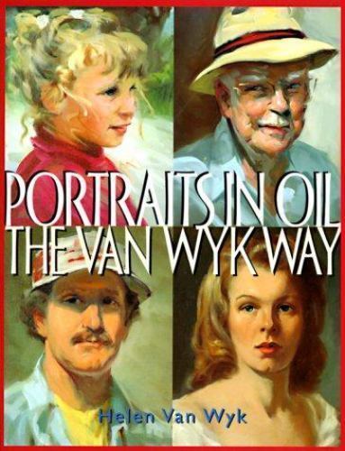
6.  Portraits in Oil the Van Wyk Way-ExLibrary

Portraits-in-Oil-the-Van-Wyk-Way-ExLibrary

Muốn mua
https://www.ebay.com/sch/i.html?_from=R40&_nkw=color+mixing+recipes&_sacat=0&_sop=15

Color-Mixing-Recipes-for-Landscapes-Mixing-Recipes-for-More-Than-500-Color
https://www.ebay.com/itm/Color-Mixing-Recipes-for-Landscapes-Mixing-Recipes-for-More-Than-500-Color/382654091069?epid=110844489&hash=item5917f60f3d:g:cscAAOSwxJ9cAt9C
Brand New

225,116.28 VND

Color-Mixing-Recipes-Color-Mixing-Recipes-for-Portraits-More-Than-500
https://www.ebay.com/itm/Color-Mixing-Recipes-Color-Mixing-Recipes-for-Portraits-More-Than-500/123466038270?epid=54040243&hash=item1cbf263bfe:g:fF0AAOSw2CBb3M2f
225,116.28 VND
Brand New


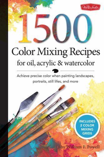
1,500 Color Mixing Recipes for Oil, Acrylic & Watercolor: Achieve precise color
1-500-Color-Mixing-Recipes-for-Oil-Acrylic-amp-Watercolor-Achieve-precise-color
273,720.93 VND
Like New


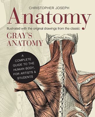
Anatomy-A-Complete-Guide-to-the-Human-Body-for-Artists-amp-Students-by-in-Used

https://www.ebay.com/itm/Anatomy-A-Complete-Guide-to-the-Human-Body-for-Artists-Students-by-in-Used/123688279683?hash=item1ccc655e83:g:zJQAAOSwWxNYrLpz#rwid
186,279.07 VND
Like New


"Fill You Oil Paintings With Light and Color" By Kevin MacPherson $13.57*

"The Big Book of Painting Nature in Oil" by S. Allyn Schaeffer $15.68*

"Brush Work for the Oil Painter" by Emile Gruppe $44.45*

"Ways With WaterColor" by Ted Kautzky $8.00*

"The Watercolors of John Singer Sargent" by Carl Little $12.00*

"The Illuminated Landscape" by J.J. Smith / Peter Poskas $27.00*

"Composition of Outdoor Painting" by Edgar Payne N/A

"Capturing Light in Oils" by Paul Strisik $99.00*

"Creating Impressions and Landscapes in Oil" by Colley Whisson $16.41*

"A Proven Strategy for Creating Great Art" by Dan McCaw $19.01*

"Expressing the Visual Language of the Landscape" by Jennifer King $4.95*

"Alla Prima: Everything I know about Painting" by Richard Schmid $147.00*

"Carlson’s Guide to Landscape Painting" by John F. Carlson $3.99*

"Oil Painting: The Workshop Experience" by Ted Goerschner $10.99*

"The Pleasures of Painting Outdoors" by John Sobart $20.00*

"Oil Painting With a Basic Palette" by Morgan Samuel Price $72.50*

"Landscape Painting in Watercolor" by Zoltan Szabo $6.00*

"Zoltan Szabo Paints Landscapes" by Zoltan Szabo $10.99*

"Tony Couch’s Keys to Successful Painting" by Tony Couch $49.99*

"Watercolor: You Can Do It!" by Tony Couch $35.00* www.tonycouch.com

"Painting Basics", plus many other books and many videos by Jerry Yarnell $5.16* www.yarnellart.com 

"Painting Better Landscapes" by Margaret Kessler $10.00*

"A Light Touch: Successful Painting in Oils" by David Curtis $137.00*Note: Mine says $19.87.

"Oil Painting Pure and Simple" by Ron Ranson, Trevor Chamberlain $35.00*

Blender - How to fix some errors (updating)

I. Mirror not working:  1. Shift S and select World of origin or Shift C 2. Select the object, right-click then select 3D cursor https://www...