1. Đất sét gốc dầu, còn gọi là đất sáp, là loại đất sét nặn mô hình gốc dầu, luôn mềm mại, dễ nặn, không chịu được nhiệt độ cao. Thường dùng để lên khuôn.
(Oil-based modelling clay can be tricky for detailed work. But it stays soft and workable, making it good for practising with.)
Mắc tiền có: Monster clay (600K/1 ký)
Rẻ tiền có: Mango 100K / 1 ký
2. Đất sét gốc Nhựa (polymer) cũng mềm giống đất dầu, mà lại nướng bằng lò nướng bánh được. Nhưng dễ nứt tét.
(• Polymer based modelling clay is equally soft and can be baked in a household oven to fix a composition. It can be prone to cracking though.)
Có loại có nhiều màu: đất sét nhật 24 màu chỉ 300K, loại Polymax 3 và 5: 700K / ký (bán nửa ký), Sculpey, Fimo
Giá đất sét Polymer của hãng Fimo: Fimo Professional 85 gr : 130.000 vnđ
Giá đất sét Polymer của Sculpey: Sculpey Super Living Doll: 430.000 vnđ nửa ký
Giá đất sét hãng Kato Polymer Clay: 100.000 vnđ
3. Đất sét gốc nước, còn gọi là đất sét nung hay đất sét làm gốm, sau khi nặn, phải nung trên 121 độ mới cứng. Đây là cách làm gốm gia dụng.
(• Pottery or ‘firing’ clay – a water-based clay which can be shaped and fired at temperatures in excess of 121°C to stay firm. This is the method used for creating household ceramics.)
4. Đất sét tự khô, thường có gốc nước. Tự khô không cần nung lò. Mềm, dễ nặn. Thêm nước để làm mềm. Để trong không khí vài tiếng là khô hoàn toàn, cứng như nhựa. Có loại gọi tên là đất sét nhật, đất sét thái. Giá khoảng 300K / 150 gr
(Air-dry clay is usually water-based clay. As you can tell by the name, air-dry clay can be dried using the air around you, and it does not need to be kiln-fired. It cures in air, without the need for exposing the sculptures made with this type of clay to high temperatures.)
Bố cục vuông hoặc sẽ siêu đẹp hoặc sẽ siêu xấu. Hiếm khi mình thấy tranh cổ của các nghệ sĩ bậc thầy có dạng bố cục vuông. Là vì rất khó cân đối các yếu tố trong tranh , ví dụ một nhóm người trong tranh phong cảnh vuông. Rất dễ thấy vụng về . Tuy nhiên, nếu chủ đề đương đại, trừu tượng hoặc vẽ cảnh biển tối giản, thì bố cục vuông có thể rất hiệu quả.
The square format: This can work extremely well or very badly. You very rarely see a square old master painting. This is because it is harder to balance a painting that has lots of elements within, for example, a collection of figures in a landscape within a square format. It can look awkward very easily. However, using a square format for a more contemporary subject, an abstract or a minimalist seascape, can be very effective.
Hãy lượt qua vài kỹ thuật bố cục quan trong khi lên bố cục tranh vuông.
Let’s take a look at some important composition techniques to consider when compose square paintings.
1. Đặt chủ thể vô chính giữa 1. Place Your Subject In The Center
Nếu chủ thể đủ nổi trội và thu hút ánh nhìn.
Generally speaking, central subject placement works great in square paintings as long as the subject is so strong that it can stand on its own and keep the attention of the viewer.
2. Lấp đầy khung tranh
2. Fill The Entire Frame
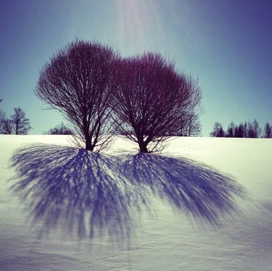
Nếu mục đích là để trình diễn một chủ thể khác thường, hãy để chủ thể choán đầy khung tranh.
If the primary goal of your painting is to showcase an unusual subject (or a group of subjects such as the two trees and their shadows in the photo above), it can be a good idea to let the subject fill the entire frame of the painting.
3. Bố cục đối xứng
3. Make Use Of Symmetry
Dù phạm luật 1/3, nhưng trong tranh vuông, bố cục đối xứng rất hợp. Đối xứng sẽ nhấn mạnh chủ thể nằm giữa tranh.
Symmetry is yet another technique that works really great for square painting, even if it breaks the basic composition rules such as the rule of thirds.
Just like central subject placement, symmetry is great for putting a strong emphasis on one central subject that takes up the entire visual weight of the photo.
4. Cẩn trọng với luật 1/3
4. Be Careful With The Rule Of Thirds
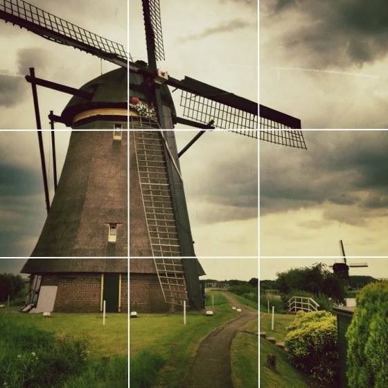
Luật 1/3 phổ biến trong hướng dẫn lên bố cục, nhất là trong tranh phong cảnh, và đôi khi tranh vuông dùng quy luật 1/3 cũng tốt. Như trong ảnh cối xay gió dưới đây.
The rule of thirds is by far the most common composition guideline, and while it works best for landscape photos, there are times when it also works in square format. From my experience the rule of thirds works best if the subjects are large, such as the windmill below.
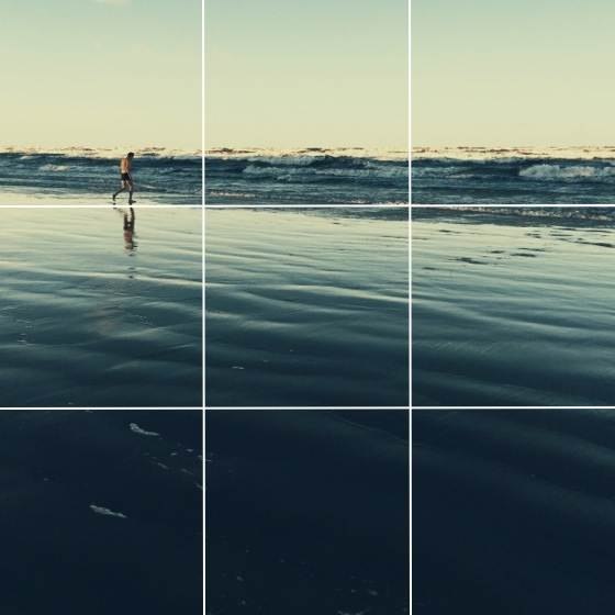
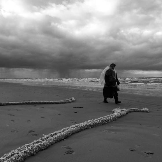
Nhưng nếu chủ thể nhỏ hơn, thì nên dời sang rìa tranh. Trong hình dưới, hình người được đặt lệch trái, để nhấn mạnh biển mênh mông.
However, for smaller subjects I often get better results by moving the subject more towards the edge of the painting. In the following photo placing the man at the intersection of the gridlines seemed far too central, so I placed him more towards the left edge which allowed me to put more emphasis on the vastness of the beach.
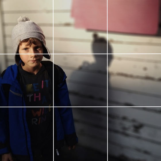
Chân dung cũng vậy, đặt mặt thằng bé hướng về rìa hình để thấy nhiều hơn bối cảnh xung quanh .
The same principle can be seen in the following portrait photo. The face of the boy is placed more towards the edge of the photo in order to position him in the surrounding context.
5. nâng cấp luật 1/3
5. “Upgrade” The Rule Of Thirds
Thay vì chỉ đặt chủ thể hướng về rìa tranh, có thể hình dung tranh là các hình vuông nhỏ tạo nên bởi cách đường kẻ theo luật 1/3.
Rather than simply placing the subjects “more towards the edge” than suggested by the rule of thirds, it can be very helpful to think about your square photos in terms of smaller squares that are created by the gridlines.
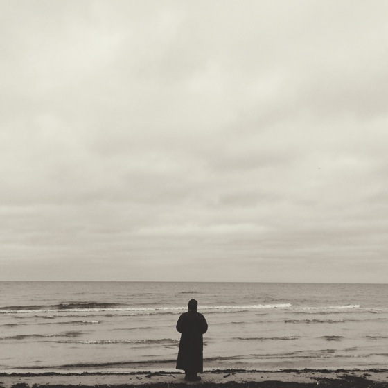
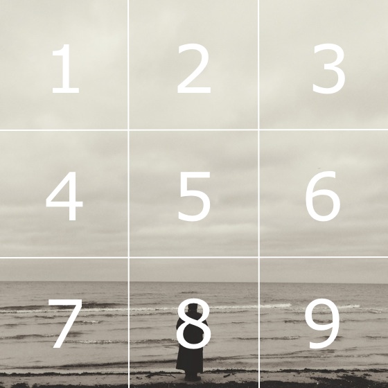
Áp dụng vô bức ảnh người phụ nữ cô đơn bên bờ biển.
Let’s apply this concept to the photo of a lone woman on the beach.
Bạn thấy người này nằm giữa hình vuông số 8. Các chủ thể nhỏ nên đặt vào giữa bất kỳ 8 ô nào ở viền ngoài, riêng ô số 5 chỉ dành cho chủ thể rất nổi.
After applying the squares, you can see that the women is placed centrally in square 8. Small subjects that fit into one square should be placed in the center of any of the eight squares on the outside, while square 5 should be reserved for very strong subjects only.
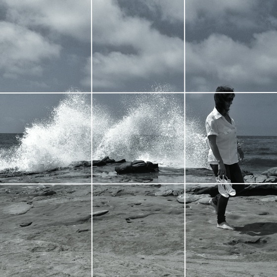
In this example the subject is placed almost entirely in square 3, which looks much better than placing the subject at the intersection of the gridlines.
If your subjects are taller (such as a standing person), you can combine the different squares intozones, where the subjects can once again be placed centrally. For example, in the following photo squares 3, 6 and 9 are combined to create a zone in which the woman is placed centrally, while squares 4 and 5 create another zone for the splashing water.
Dividing photos into smaller squares and then combining them into zones is a tip I picked up from iPhone Camera Essentials video course. My readers can get a 50% discount for iPhone Camera Essentials through this special discount link.
6. Dùng đường chéo
6. Use The Diagonals
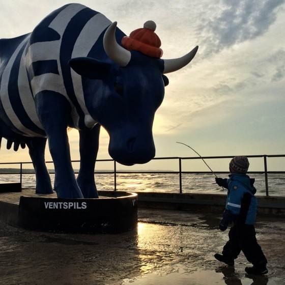
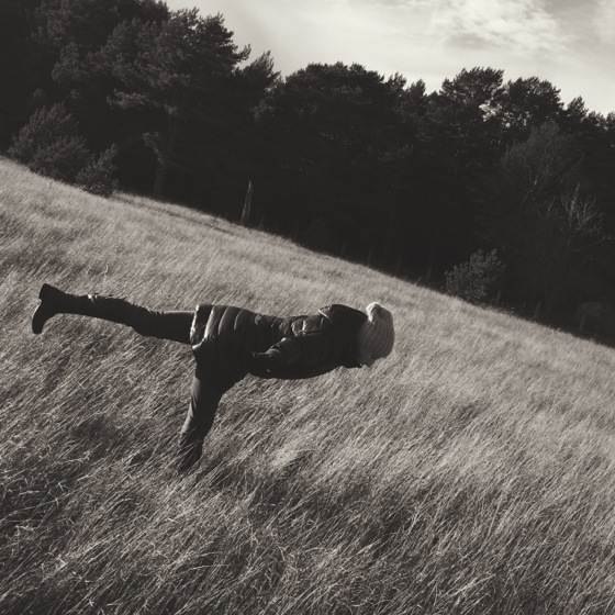
Đặt chủ thể quan trong theo đường chéo để cân bằng cả về chiều ngang lẫn chiều dọc..
The diagonal principle states that you should place the important subjects in your photo diagonally so that it stays balanced both horizontally and vertically.
Trong bức hình này, thằng bé và con bò khổng lồ được đặt theo đường chéo. Nhấn mạnh tương tác giữa hai chủ thể, khiến ta thấy như con bò to hơn nhiều, và làm bức hình cân bằng.
In this photo the two main subjects – the boy and the massive cow – are positioned diagonally. This puts more emphasis on the interaction between the subjects, makes the cow appear much, much larger and also keeps the photo balanced both horizontally and vertically.
7. Dẫn mắt nhìn về phía chủ thể
7. Lead The Eye Towards The Subject
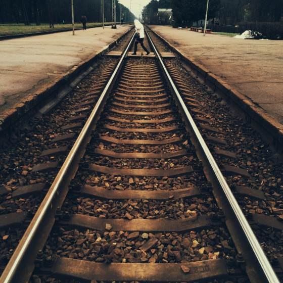
Leading line là đường thu hút mắt nhìn về chủ thể chính. Đặt đường dẫn trong tranh vuông khá khó vì không đủ chỗ.
Leading lines are any lines that draw the attention of the viewer toward the main subject of your painting. While leading lines tend to work well on any photography format, it can be challenging to put them into a square format simply because there isn’t enough space for them.
Ta có thể dùng đường dẫn kéo dài từ tiền cảnh suốt đến hậu cảnh.
You can also use leading lines extending from the foreground into the background.
8. Hãy dùng cách khoảng trống
8. Use Empty Space
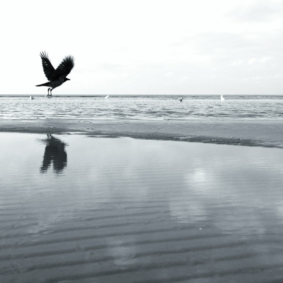
Tranh mà lộn xộn, đặt nghẹt, thì khó mà đẹp, nhất là tranh vuông, vì ta có ít chỗ để bày trí.
It’s hard to make a crowded, messy painting look good, and this is especially true for small square paintings where you have less space to spread out your subjects.
Nhớ là trong bố cục chẳng có quy luật cứng nhắc nào. Cứ làm theo trực giác và đừng ngại bỏ qua các luật lệ, bí quyết, hướng dẫn, nếu thấy thích thế.
Always remember that there are no hard rules in composition, and while it certainly helps to know the tips and guidelines that are discussed in this post, you should always trust your gut feeling and not be afraid to ignore all the composition tips and guidelines if that feels right to you.